Design require tempting and uncomplicated visual to access by users regardless it has many words or less words. To achieve better understanding on design for users, designers urged to create visual hierarchy. Some considerations could be taken to create design with an effective visual hierarchy.
Understand how users read information, how designer could help users absorbed information easily. Reading through the copy is valuable for designer to determine which information hold greater value than others. The understanding would help designer interpret hierarchy of information need to be passed to users.
Hierarchy could be achieved by creating contrast. Using typeface, point size, weight, colors, and tint is important to create density of type. Visual judgments often bring the best results. It is visible and logical to determine hierarchy when designing with type. Using enlargement and reduction would be a good start to create visual hierarchy. Colors could help designer creating hierarchy. Brighter colors attract users, while paler and tint colors can be used to suppress words.
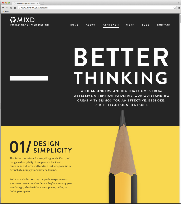
Example of effective visual hierarchy in a website
MIXD website design in my opinion has an effective visual hierarchy. It doesn’t have many colors and typefaces, but using different type sizes could create contrast and flow between words. As we can see the layout drives us to read “BETTER” and than “THINKING” in a sequence. Using upper case letters on the body, also beneficial. Readers easily read from top to bottom regardless the copy is positioned on the left.
Reference:
C. Knight, J. (2013). Creating Exciting and Unusual Visual Hierarchies. Available from http://www.smashingmagazine.com/ [Accessed 18 November 2014]
